Photography: Jim Bastardo, Styling by Studio Marcus Hay, Inc
Photography: Studio Marcus Hay, Inc
Photography: Studio Marcus Hay, Inc
Photography: Jim Bastardo, Styling by Studio Marcus Hay, Inc
Photography: Jim Bastardo, Styling by Studio Marcus Hay, Inc
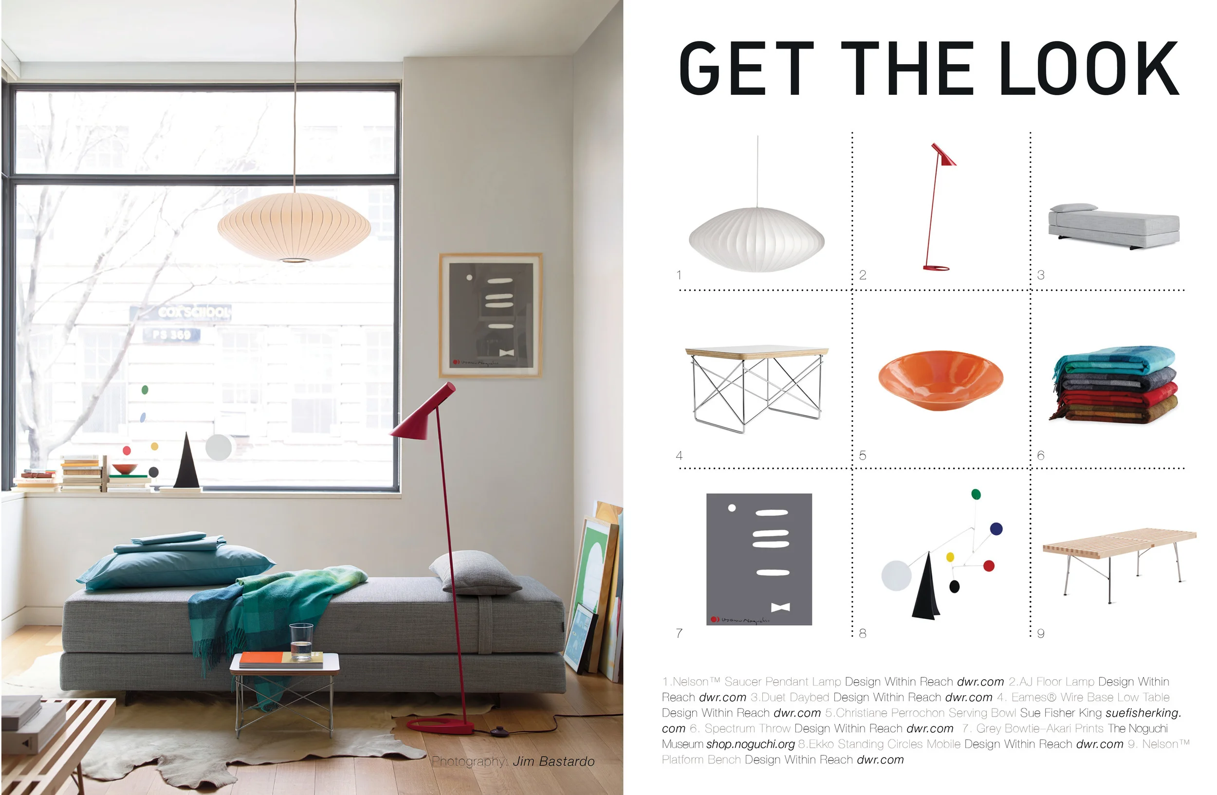
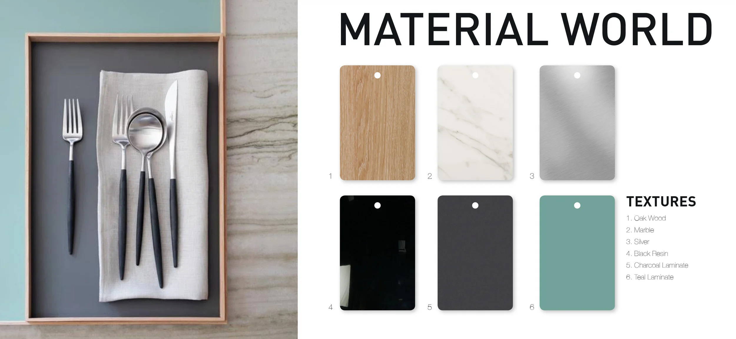
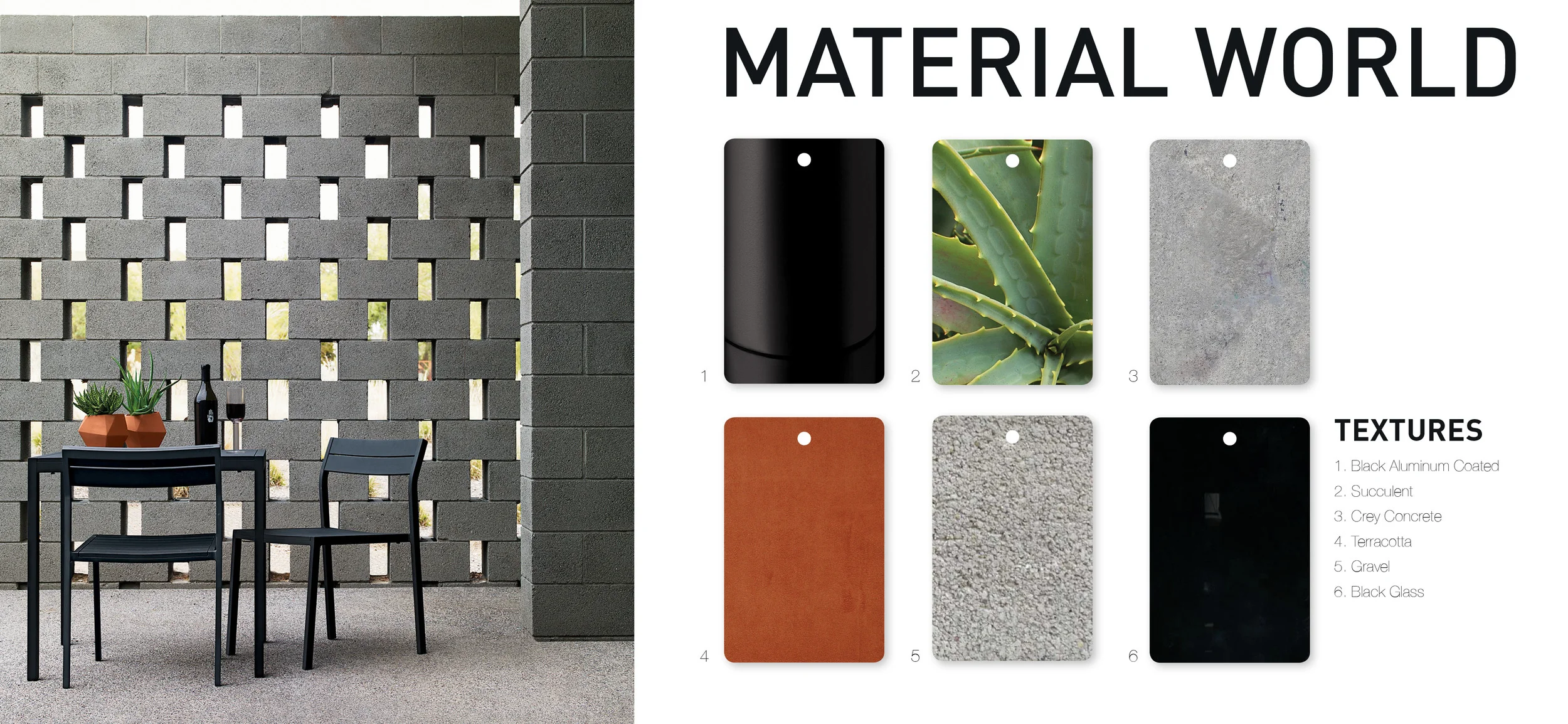
Get the look: For Design With Reach for a recent catalog, we loved creating this relaxing reading nook in a Brooklyn townhouse using Noguchi prints to accompany the space giving it that calming feel, one of our favorite ceramic artists Christiane Perrochon helped us out with a beautiful orange bowl on the windowsill to add that pop of color to an otherwise muted palette. For: Material World we explores an image we styled for Design Within Reach featuring Goa flatware and Frame trays for Munk Collective. . We loved the muted pastels and chalky like appearance of the laminate and wood product mixed with this beautiful pinky marble, It is one of our favorite palettes and combos. For another Material World we explores an image we styled for Design Within Reach in Arizona. The image featuring some great product available at DWR, we love the mix of outdoor materials at this location which was largely a palette of very masculine grays mixed with crisp fresh greens and terra-cotta.
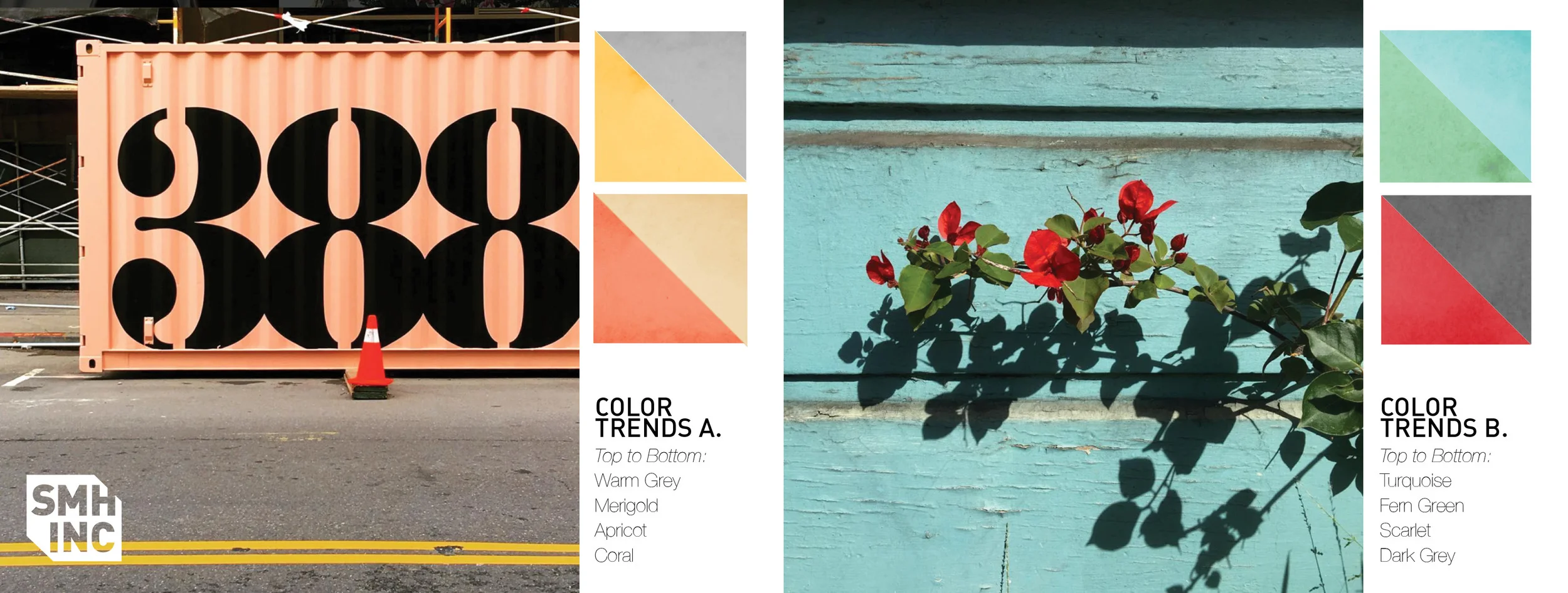
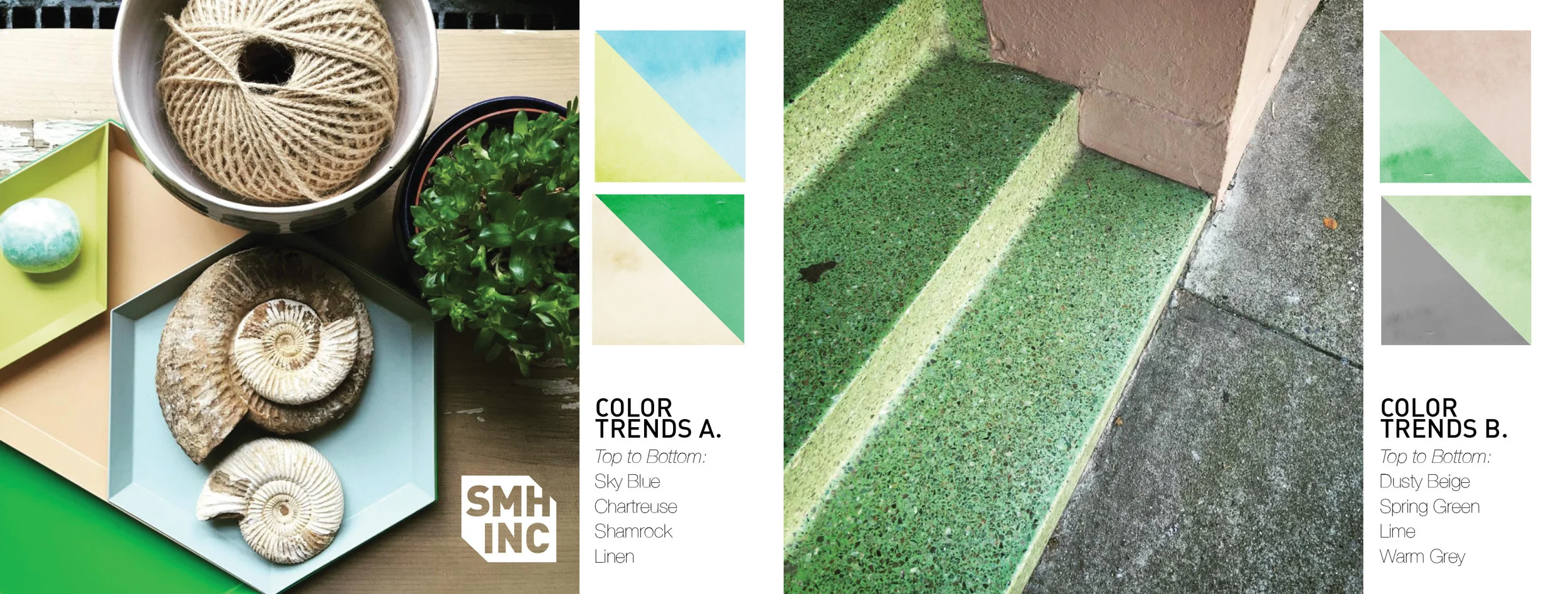
Color Trends: Two images that highlight our embracing of the warmer weather. In San Francisco we see color everywhere as Spring blooms early. The typographical impact of signage on a container positioned on the street sees apricots meeting grays and yellows. Scarlet blooms on a aged wooden torqouise wall pop in the sun. Two more images that highlight our love of pastel palette. Fresh greens always go so well with almost any color combo but when paired with dusty pinks, grays and beiges magic happens. Especially great for the Spring Season, we love this chalky combo.
See these and more in our The Lab section of the website, here.

